Menu

Building Design at Archipelago
Role
Head of Design
Description
In my role, I was tasked with scaling our design team, helping select a front-end component library, evolving the brand, building a research and testing process, and more.
Background
When I joined Archipelago in 2019, the team had only begun to establish some standard design principles within the organization. At minimum, there was a logo, some wireframes and flows of the basic product. Over the many months, we began the exhaustive work of building a design team, a product, collateral, guidelines, and more.
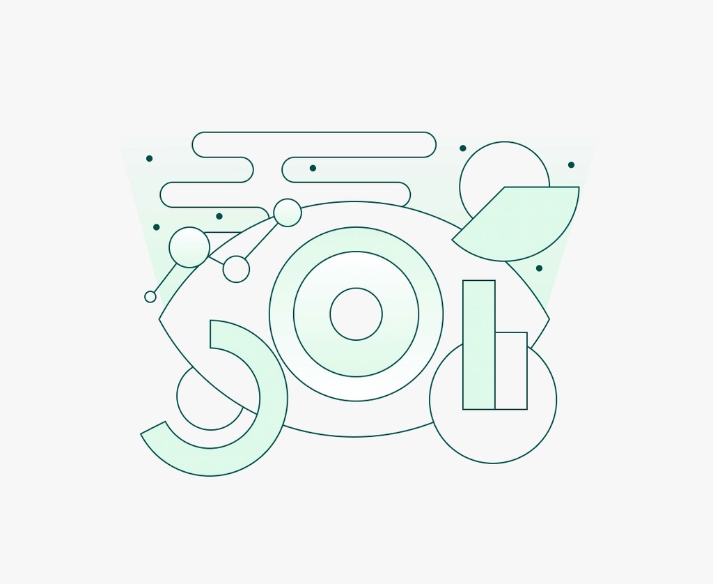
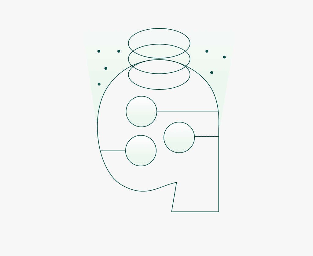
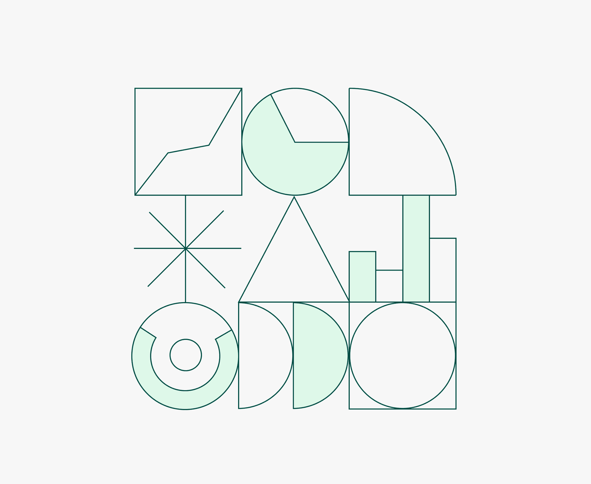
Building our visual design
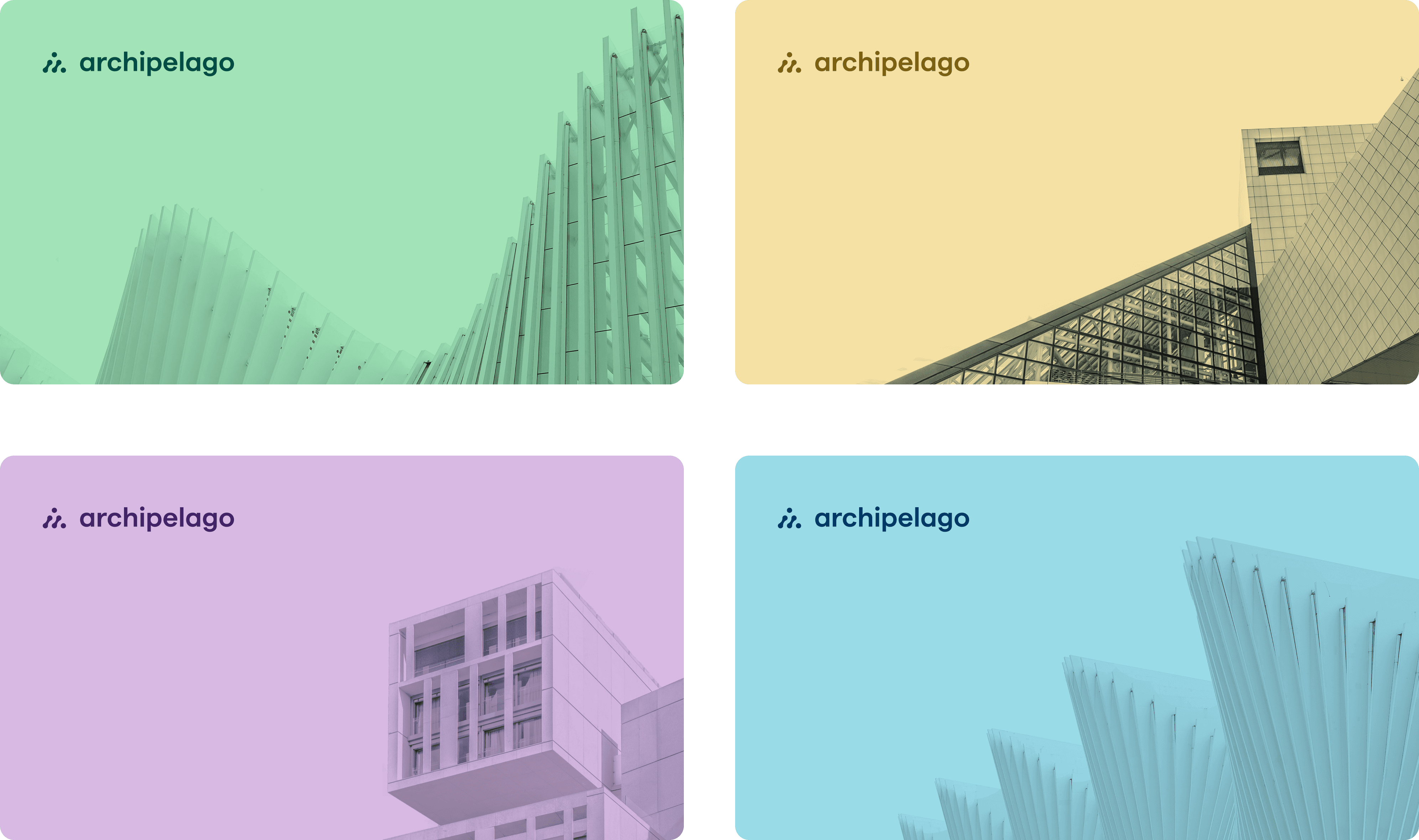
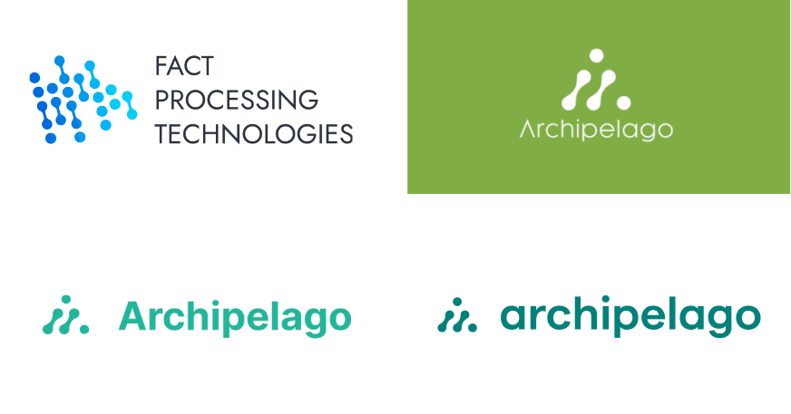
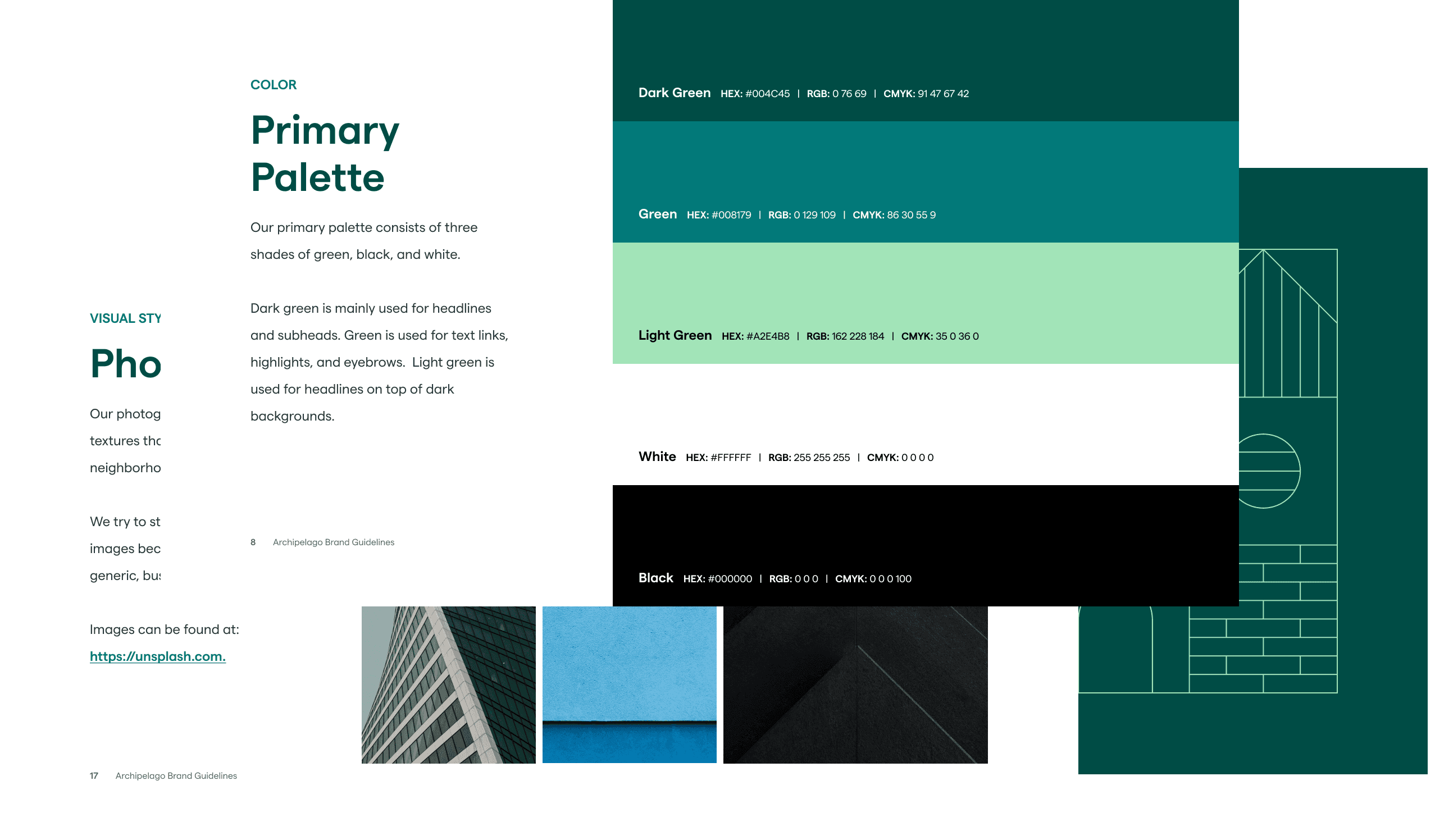
Our initial logo and palette had been restricted pretty heavily and not much work had been put into it beyond the basic mark and the primary green color. Until I had hired a dedicated Visual Designer, most of the advancement had been done by myself. Once we had more help, our momentum in evolving the brand began to accelerate.
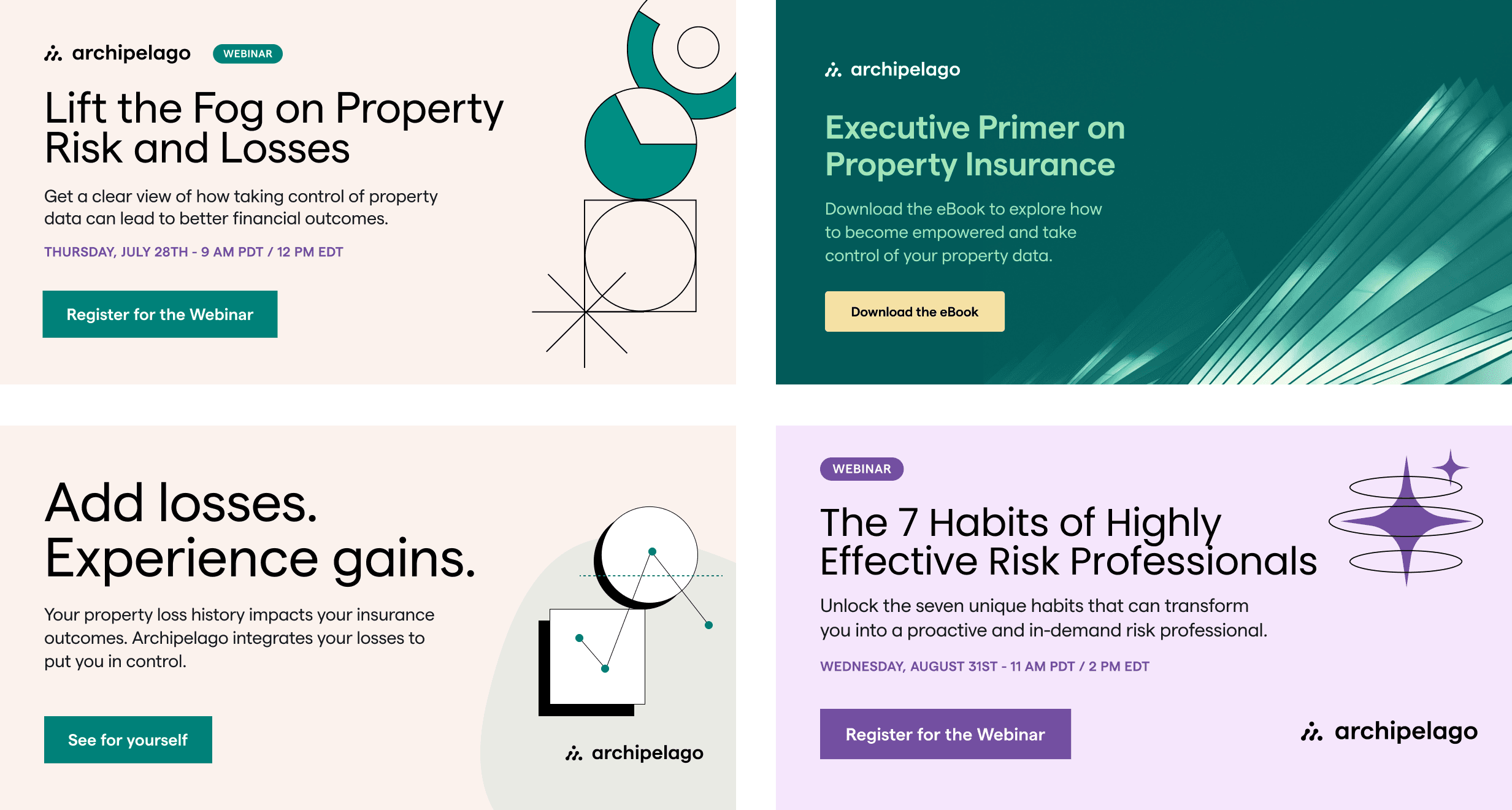
To push the brand forward, we opted to gradually alter the wordmark, tighten and adjust the logo, and rebalance the lockup. Additionally, we landed on a palette (with varying lightness) of colors that were more vibrant and welcoming. Coupled with an expanded illustration style, iconography (feather) photographic guidelines, and a new font — the brand began to feel more settled.
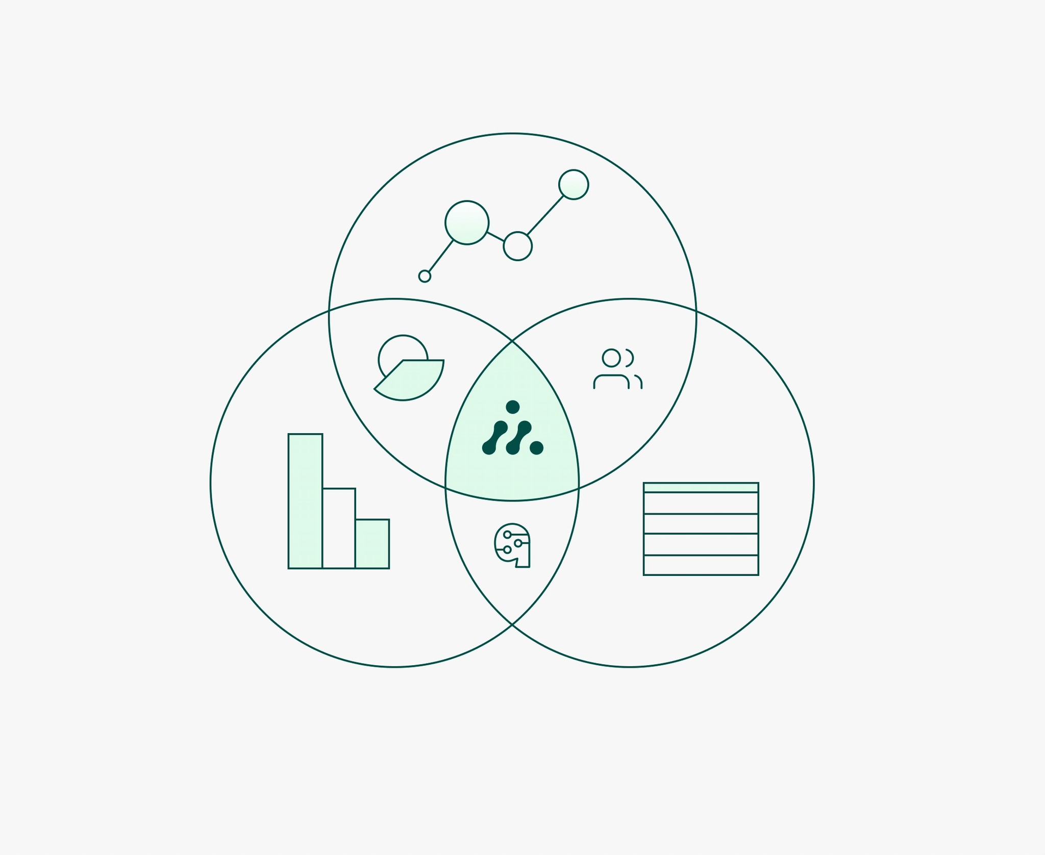
Building a product design team
Early in Archipelago's history, not much of the product had been built. We had some wireframes of the essential flows and a fairly basic customer journey map established by persona types. The frontend had stood-up a basic version of the app using the Material Design component library as well as a collection of bespoke components to meet the business requirements.
Moving as quickly as we were meant often overlooking critical concerns that would require us to adjust later. One of those adjustments came in the form of choosing a more robust frontend component library. To meet our needs, we opted out of building our own for cost sake, and I worked directly with the frontend team in selecting Elastic's EUI library to migrate to.
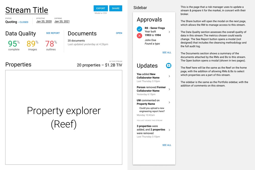
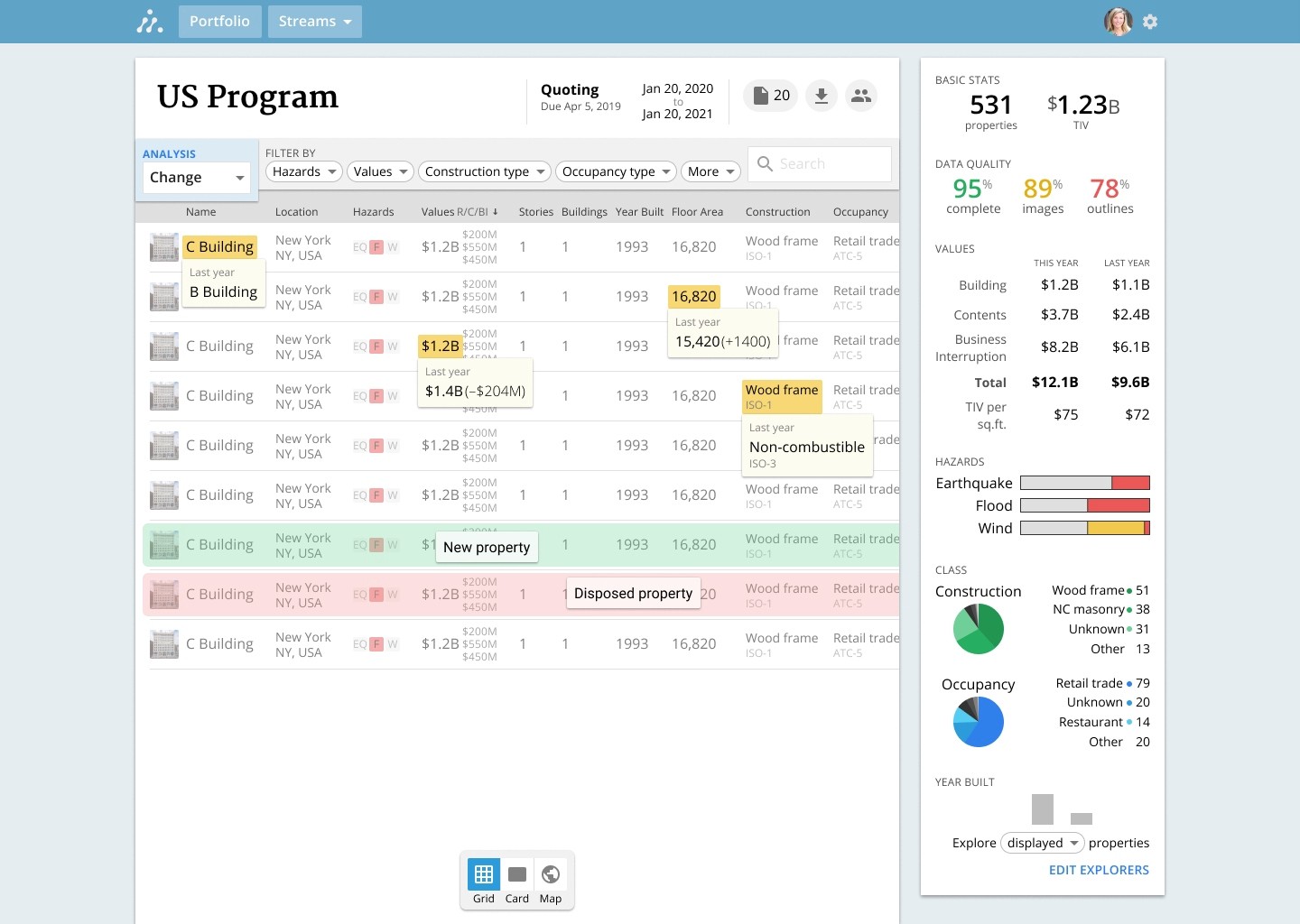
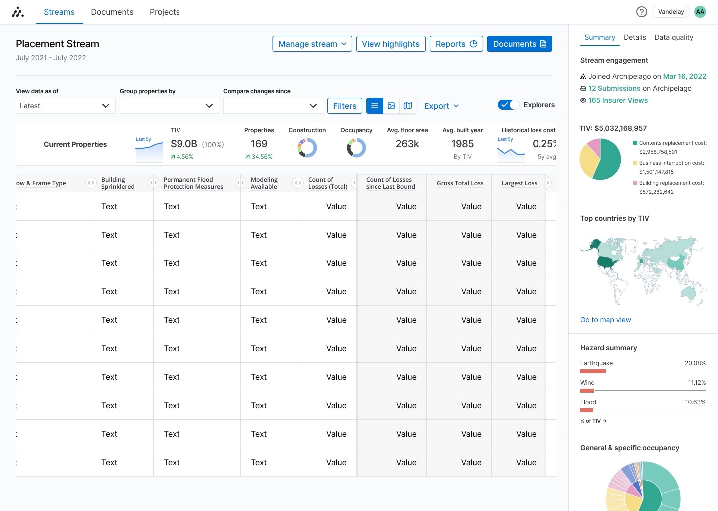
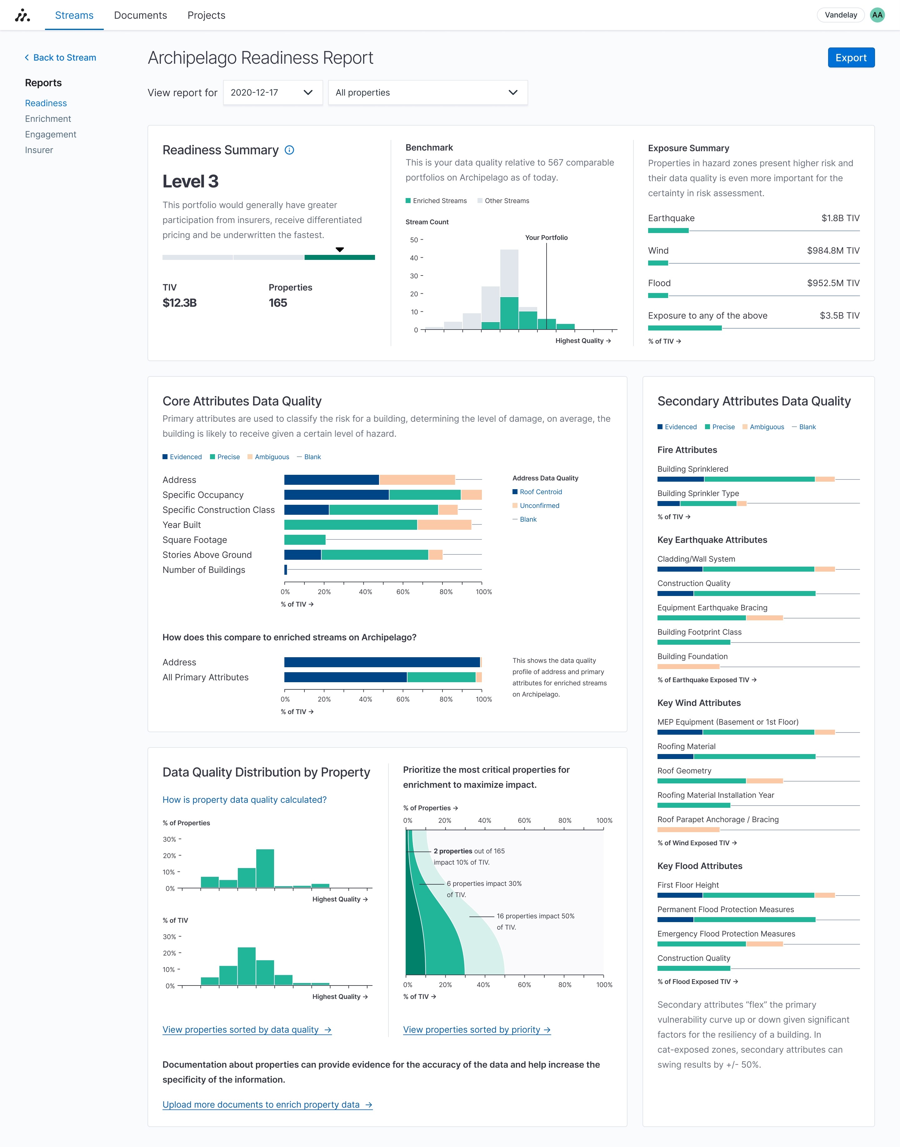
As the design team grew, utilizing a pre-built component library enabled each designer to meet the needs our customers faster, allowing us to build a design language around data onboarding, reporting and analytics, user permissions and more.
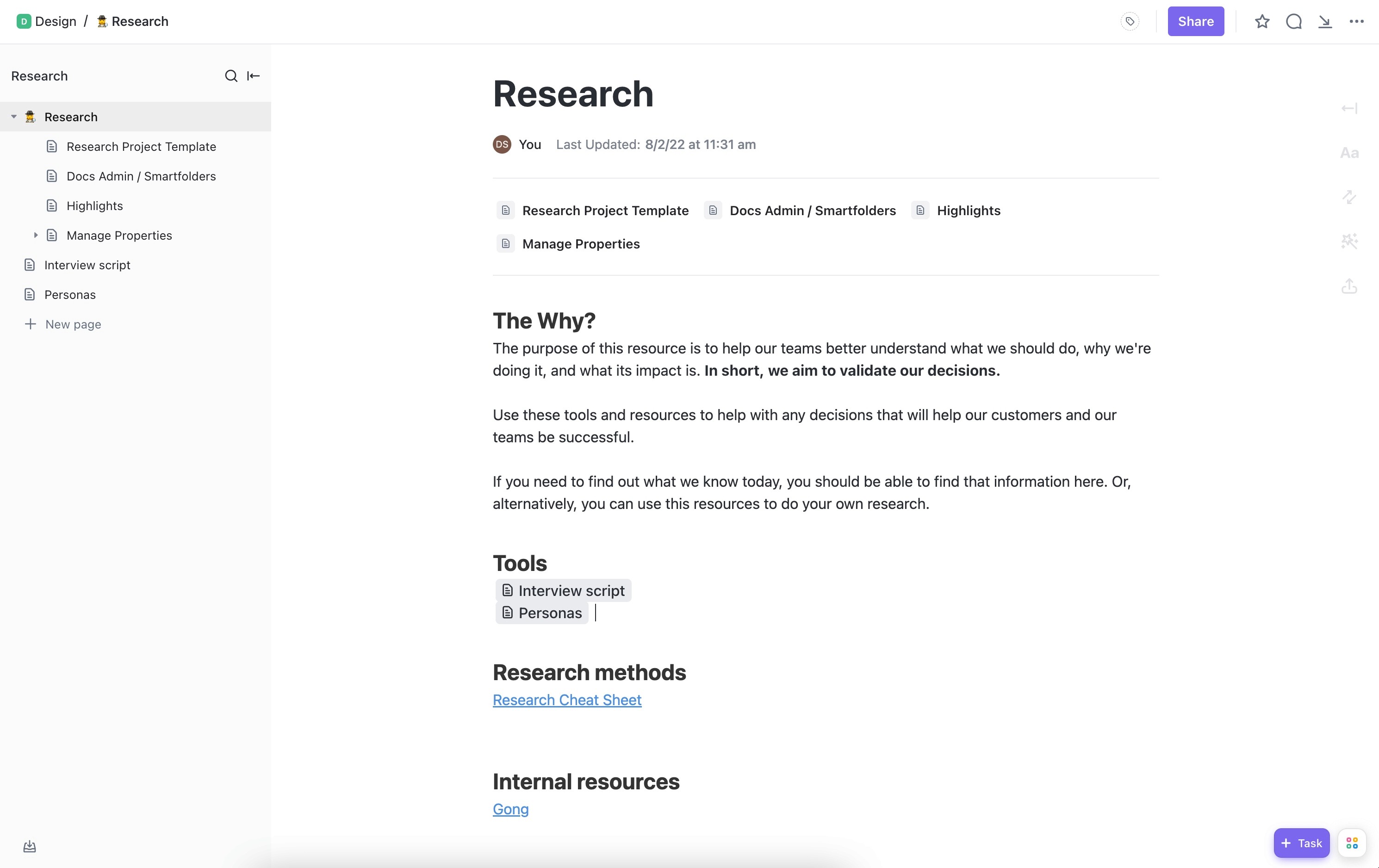
With a growing team, it meant establishing best practices for design management, collaboration, and growth for the designers within the organization. As such, we worked to establish a research repository in ClickUp, testing methodologies, a weekly design crit schedule, and active design pairing to work on difficult UX problems.
Final thoughts
Establishing the entire design ecosystem of a company is a monumental task, and often with the gift of foresight can one see areas where improvements could've been made or where specific strategic design decisions were the best choice at the time. It's very clear to me that in helping building Archipelago it was a healthy balance of the two and I'm most proud of the excellent work each designer made in contributing to the design culture as well as their individual personal developments.