Menu


Evolving brand and visual design at Docker
Role
Senior Director, Visual Design
Description
I assembled and managed a team that focused on up-leveling the Docker brand — bringing consistency and care into how we showed up visually.
Background
In 2022 I was brought in to Docker to establish a new visual design/brand team. From the start, our directive was to enforce brand consistency and find avenues of improvements that could be iterative. As a whole, it was clear that the company needed to mature in how we showed up internally and externally as part of our larger marketing strategy of becoming a multi-product organization.
Our visual identity was one that had enormous community support, but it was immediately clear just how fragmented the brand had become. There was no consistent logo or color usage, marketing materials were incorrect, the product lacked visual consistency, the events lacked allure, and the original brand guidelines had been long out of date and were not enforced.
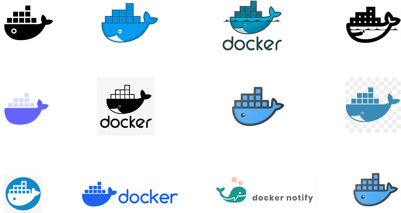
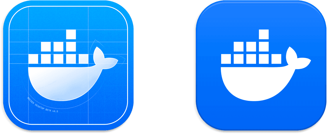
Logos show up externally without much enforcement.
Inconsistencies across logo types, colors, and web implementation.
Identifying areas of improvement
My team identified what we saw as a few immediate areas of weakness across the brand:
Logo
Color palette
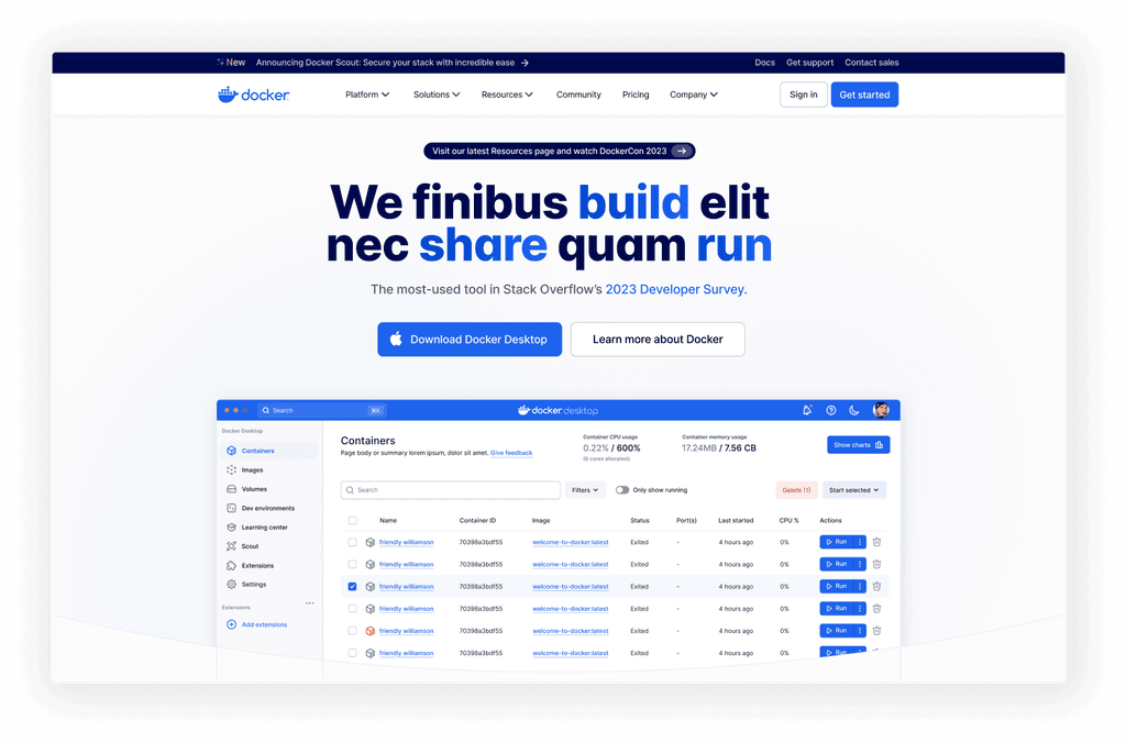
Marketing website
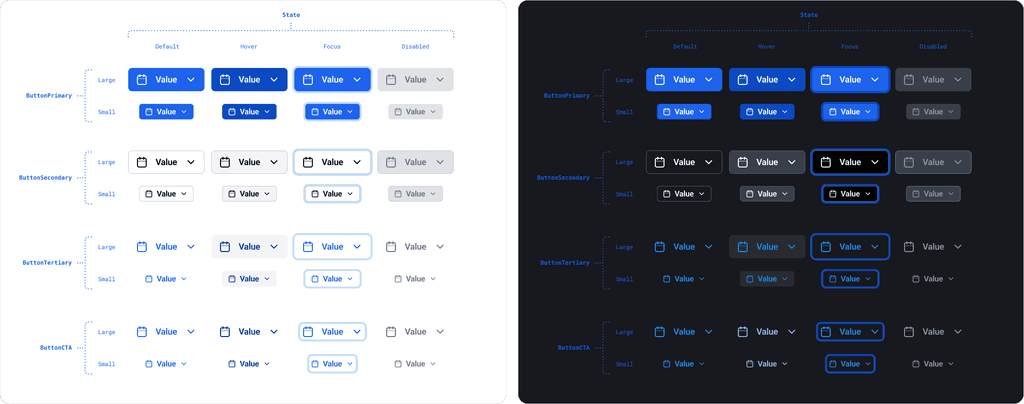
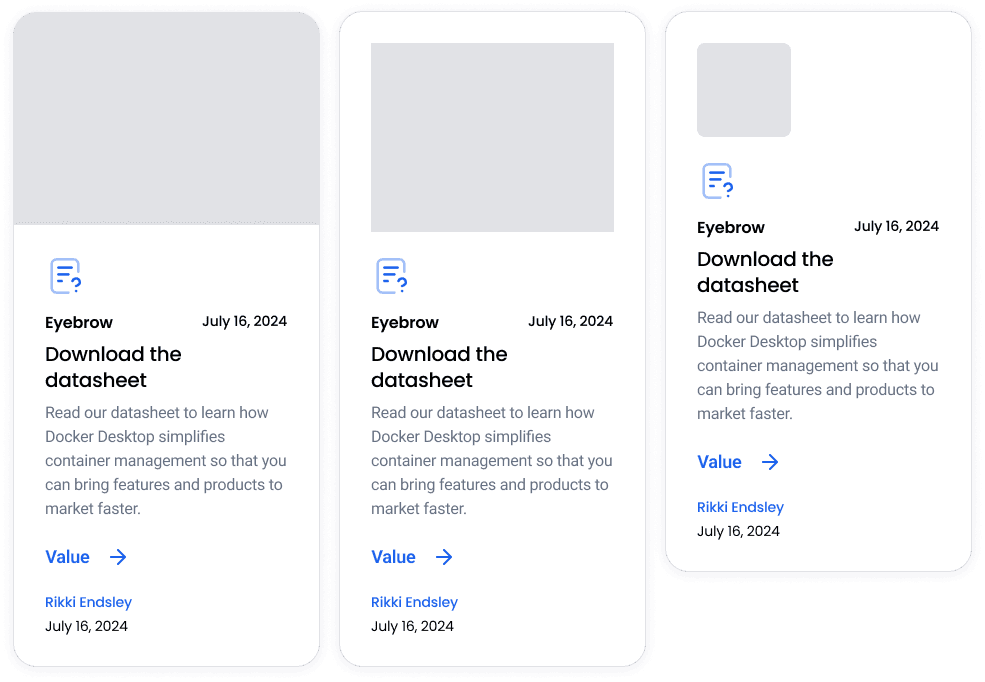
Product look and feel
Our mascot 'Moby'
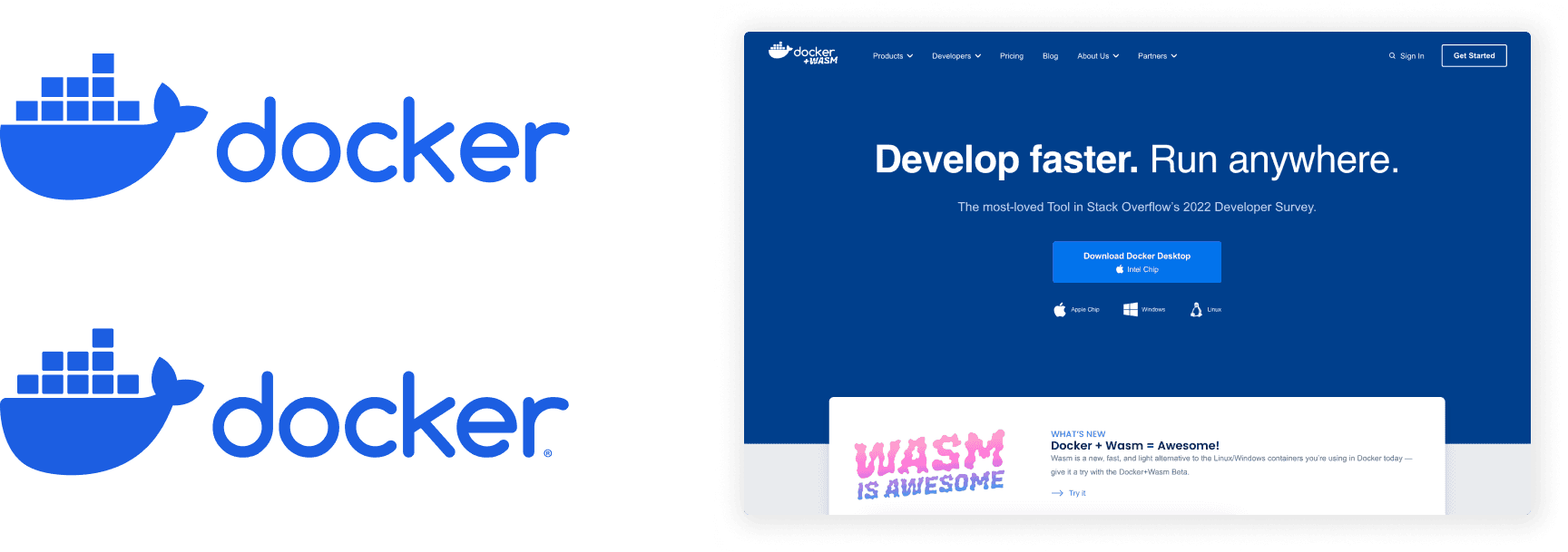
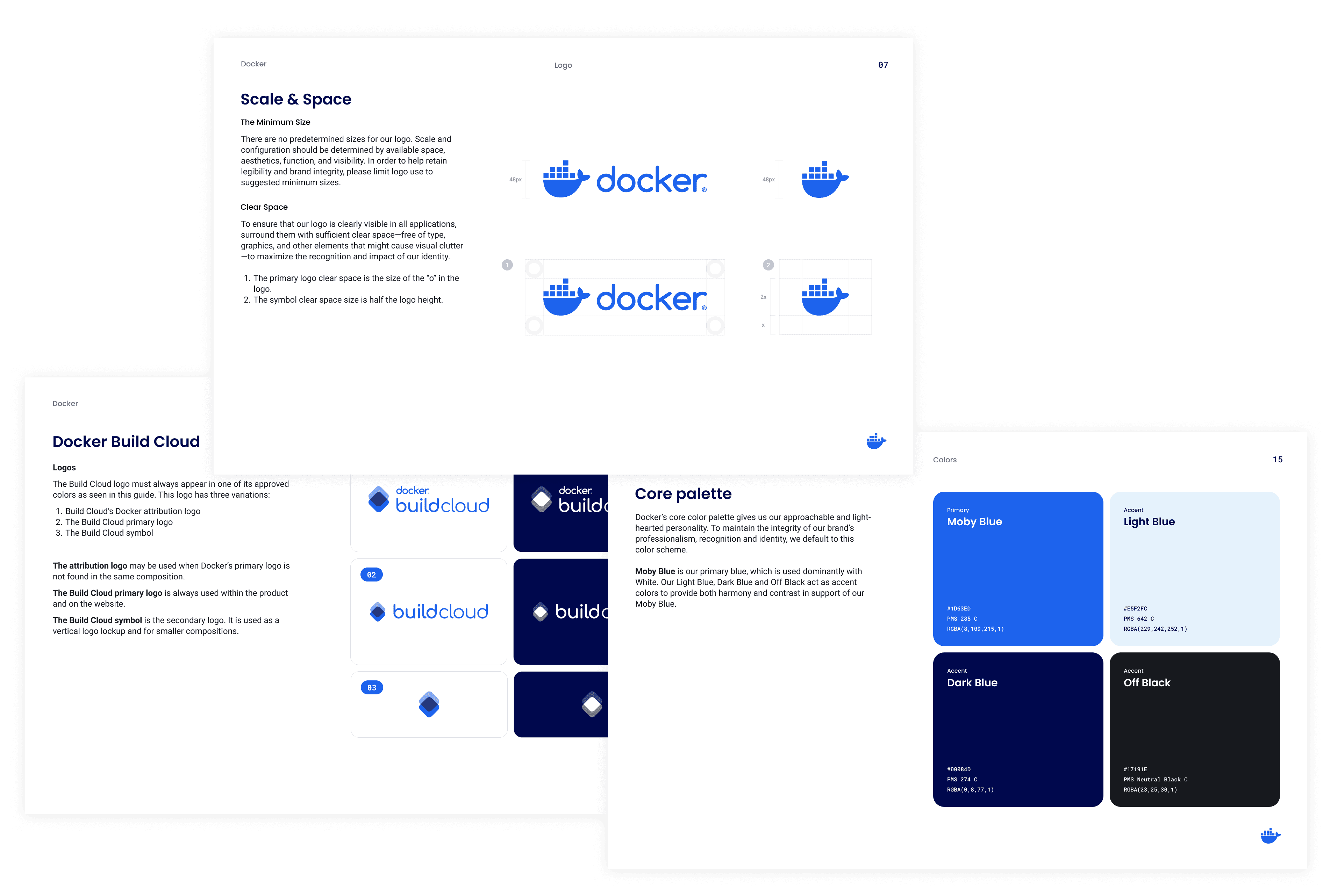
To immediately improve on our logo usage, we tightened up the design and size of the mark so that it was more balanced with the 'docker' wordmark. We also tweaked and improved upon the brand guidelines so that people were using the proper palette, product logos, typography, and icon-sets.
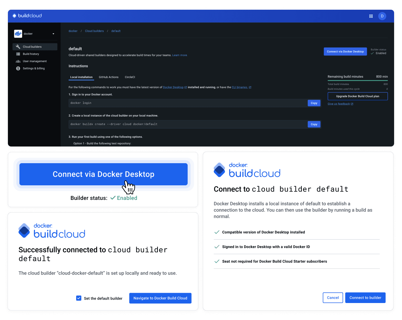
The website work required balancing new asks for pages while attempting to reskin existing components to modernize the look and feel and match the work we were doing elsewhere. Not soon thereafter, our web team and myself determined that a rearchitecting and UX improvement effort was greatly needed to right-size the site.

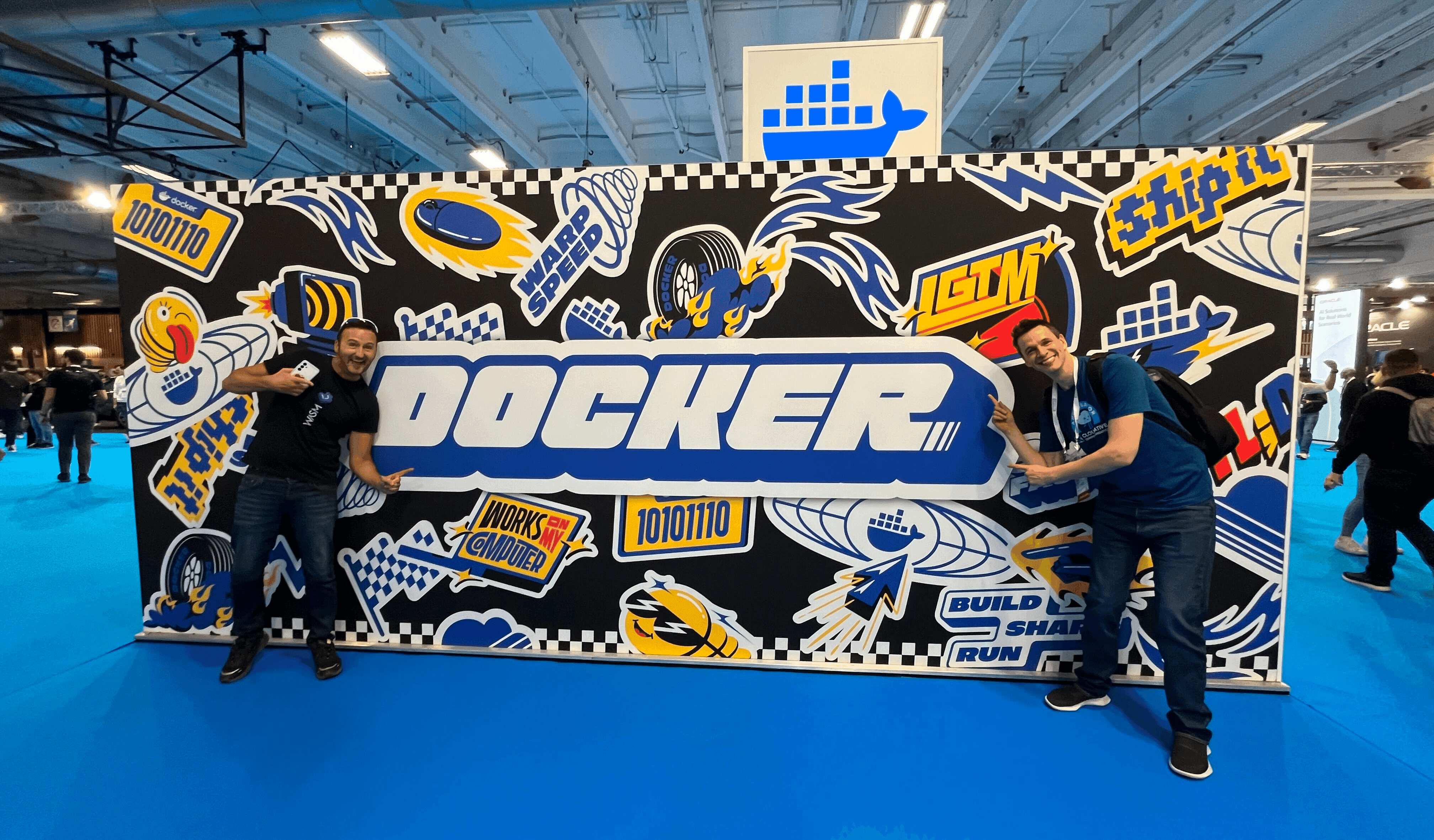
KubeCon 2024
Integrating with product
My team and I worked directly with the product teams to find areas where we could improve the overall look and feel and plan for future improvements in lockstep with brand.
This included creating product branding for recognition within the Docker suite of products, palette adjustments, illustrations, and more.
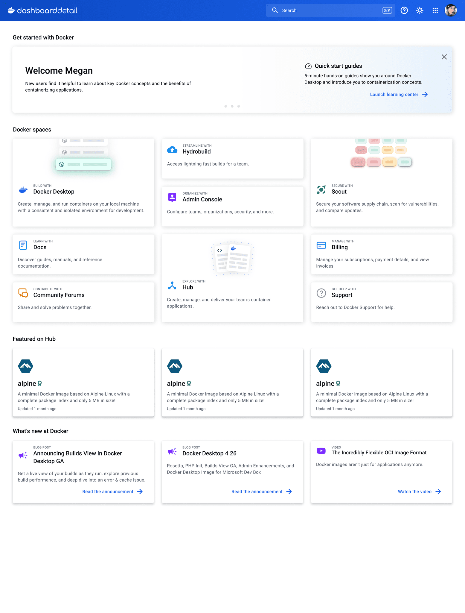
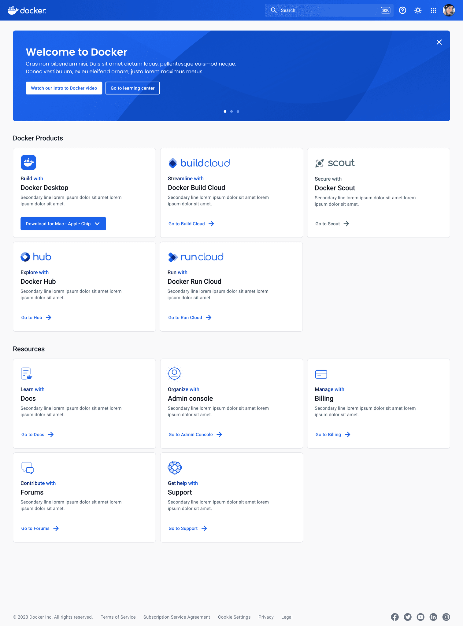
Docker Dashboard before and after.
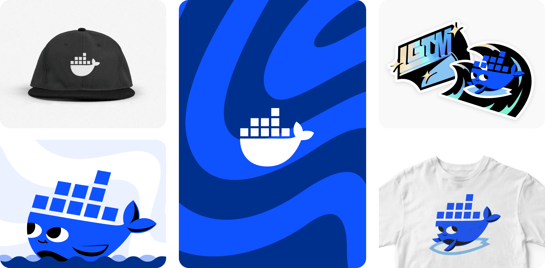
Evolving the 'Moby' mascot character
As with many tech startups, Docker used an animal mascot character to humanize its otherwise complex offerings. 'Moby' (the character's official name) resonated strongly with the developer community, but was often used as filler for content where there would otherwise be a singular content strategy.
The illustrations themselves often suffered from a dated look and made it difficult to market to enterprise companies. Our team had the task of finding the right balance of evolving the character and making it more sophisticated without losing its charm and alienating the community.
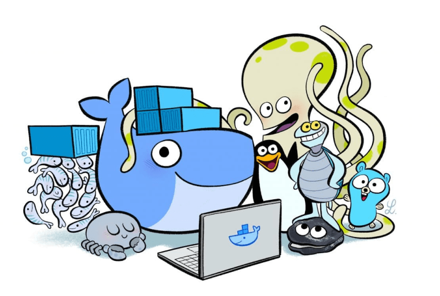
Moby 1.0

Moby 2.0

Moby 2.0
To solve this, we opted to remove the extra 'characters' that accompanied 'Moby' (which were at times associated with sunsetted products) in lieu of a singular 'Moby' that has a versatile styling and could be 'dressed-up' for a variety of situations.
Final thoughts
The difficulties of establishing a brand are a far different task than one where a startup is mid-stage and struggles to know where to go. Luckily, I am very blessed to have been given the chance to build a team where we see tremendous opportunity. Docker's best days are ahead of them and I know our work focusing on quality and attention to detail is the kind of culture shift a startup needs at Docker's stage.