Meridian Map Editing
Role
Lead Product Designer
Description
Redesigned tooling that enabled our customers to make mapping updates to their apps without as much friction or confusion.
Background
Meridian, at its most basic product offering, is a mapping company. One growing concern of our Product Managers was with map editing and management by our customers. The existing experience and functionality was difficult to use, time consuming, confusing, and buggy. The focus of this project was to make some essential updates and show to our stakeholders that our improvements had a lasting impact on customer value.
Unpacking
Based on the existing research we had (contextual inquiry onsite with customers, interviews, feedback from customer success personnel), we knew that editing and creating maps in our CMS was arduous. All of the major functionality was not built to scale, so our larger customers were facing enormous roadblocks. Additionally, some key functionality suffered from previous design choices that meant more work load for our users and represented a large hole in our customer journey map.
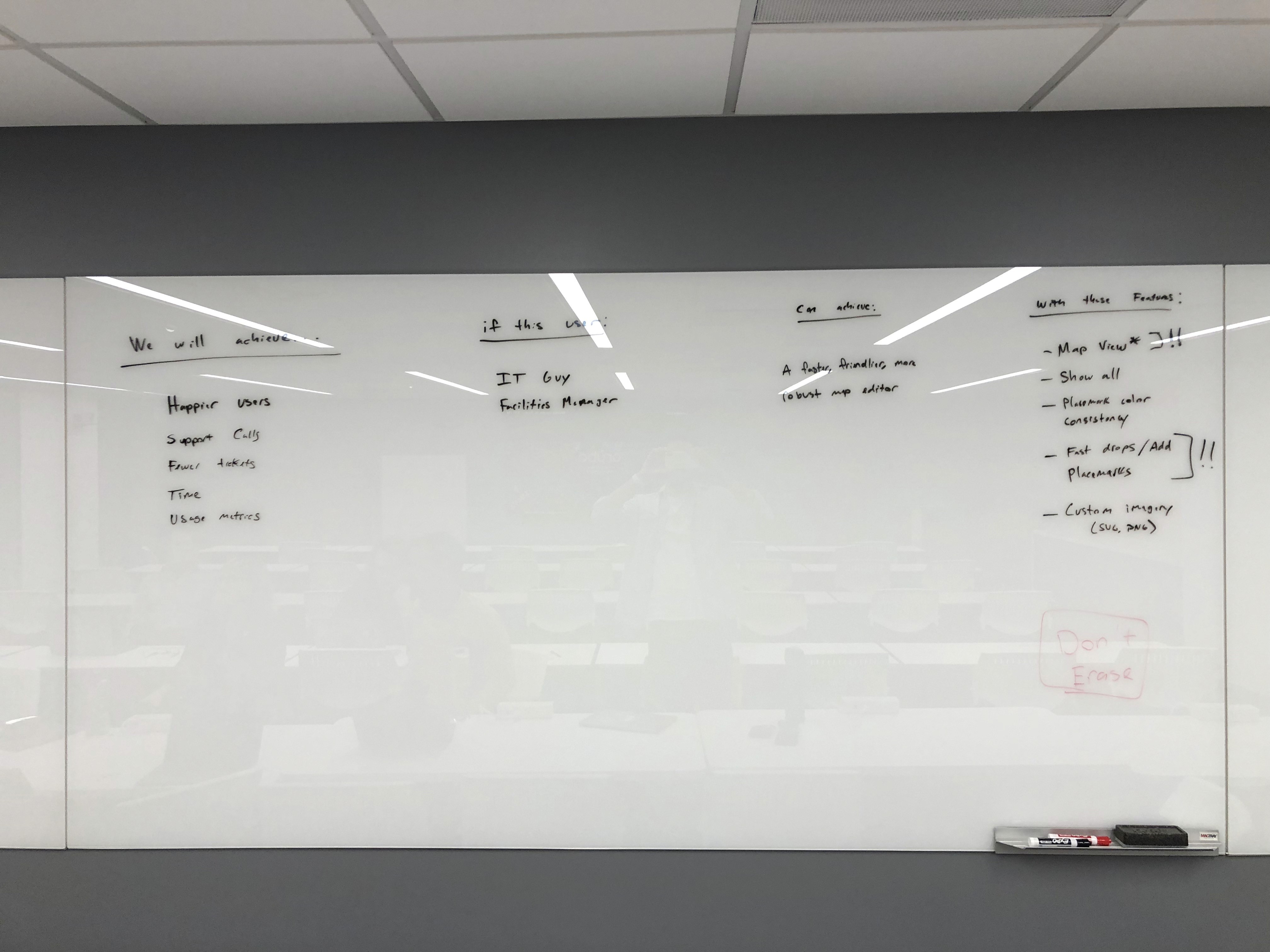
Our first design studio meeting entailed unpacking the individual problems our customers were experience, what we currently knew, technical scheduling limitations, and what should be the focus of our efforts. We prefer to work quickly, building wireframes, soliciting feedback early and often, and attempting to arrive at quantifiable results to inform our next steps.
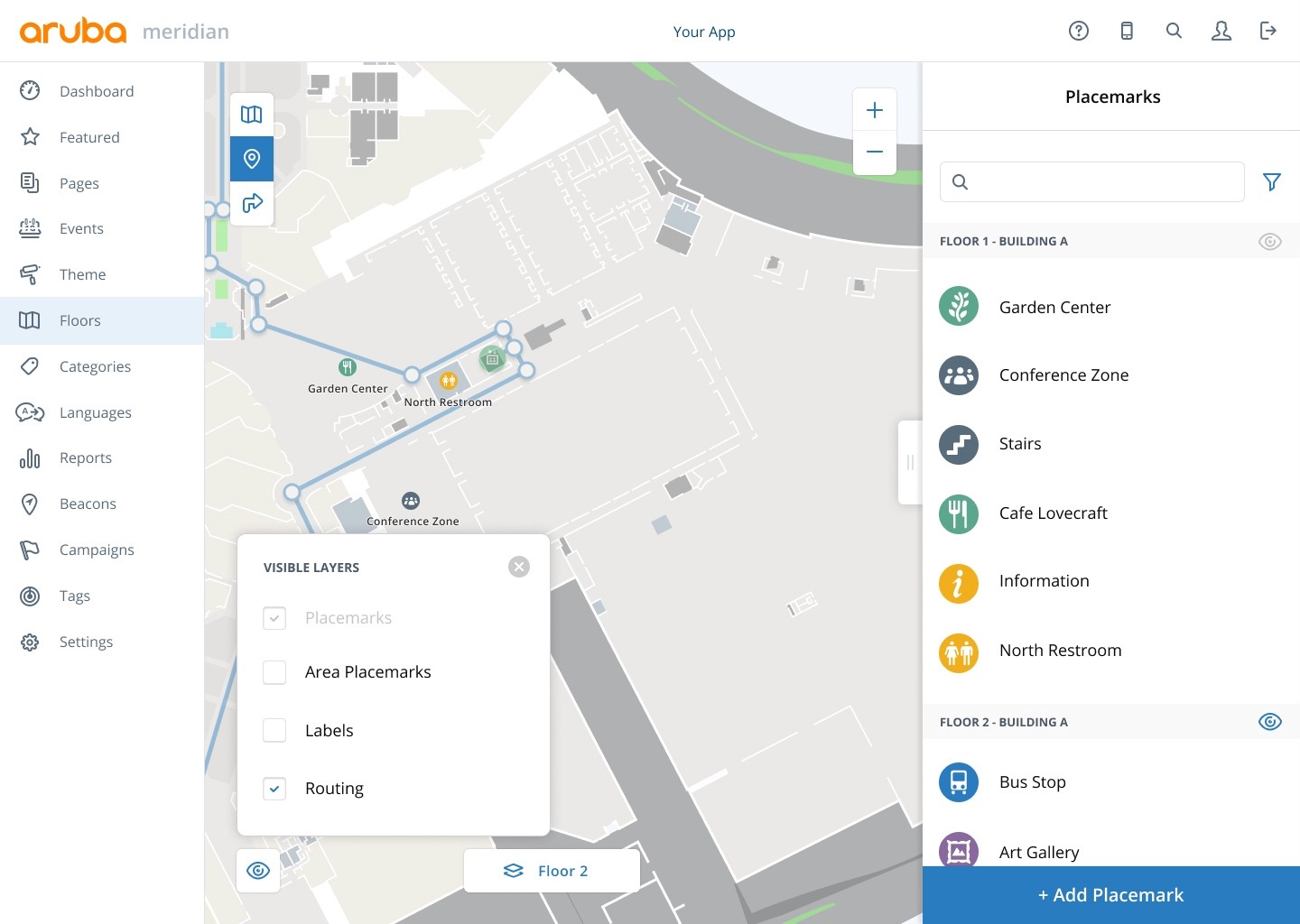
With this effort, we decided to focus the bulk of our efforts on what we call 'Placemarks' and 'Routing.'
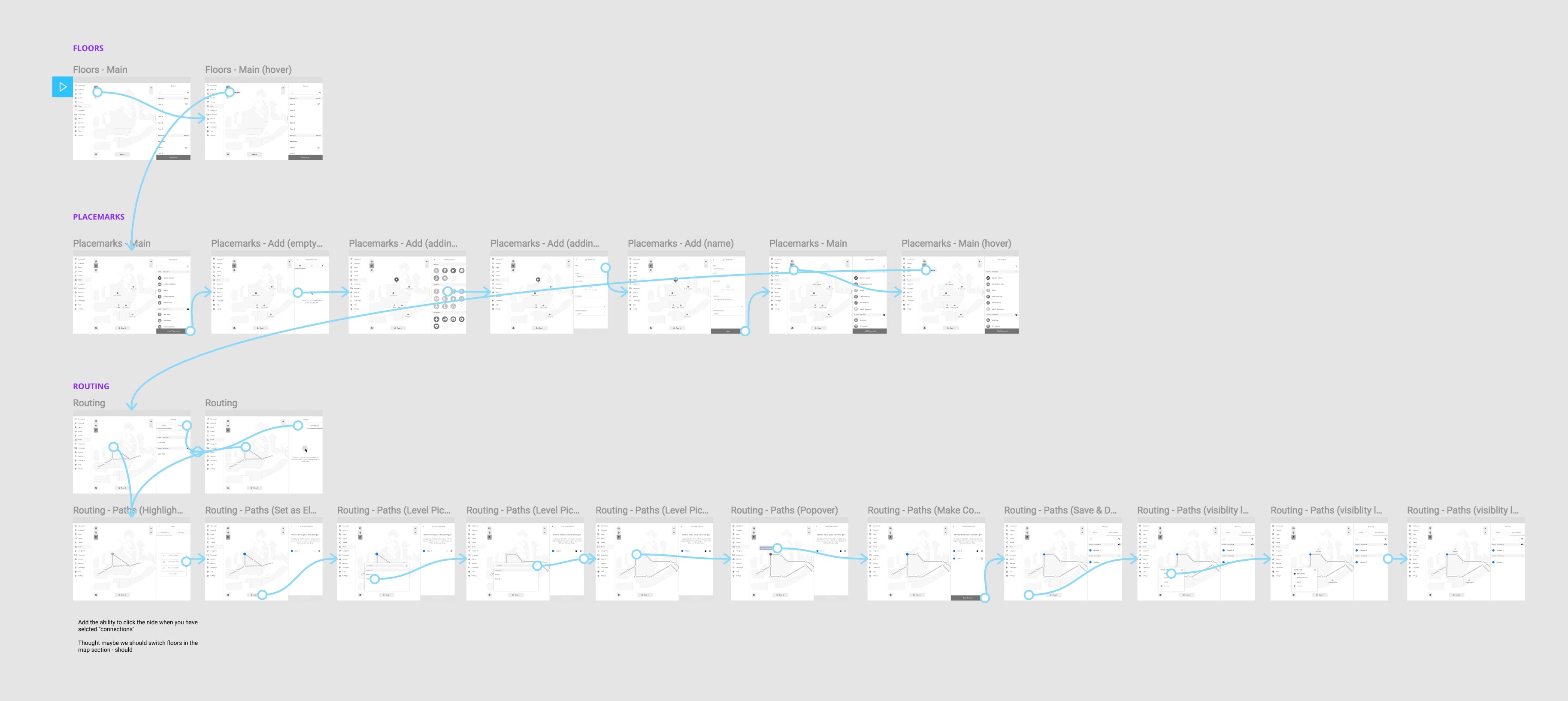
Naming conventions and workflow
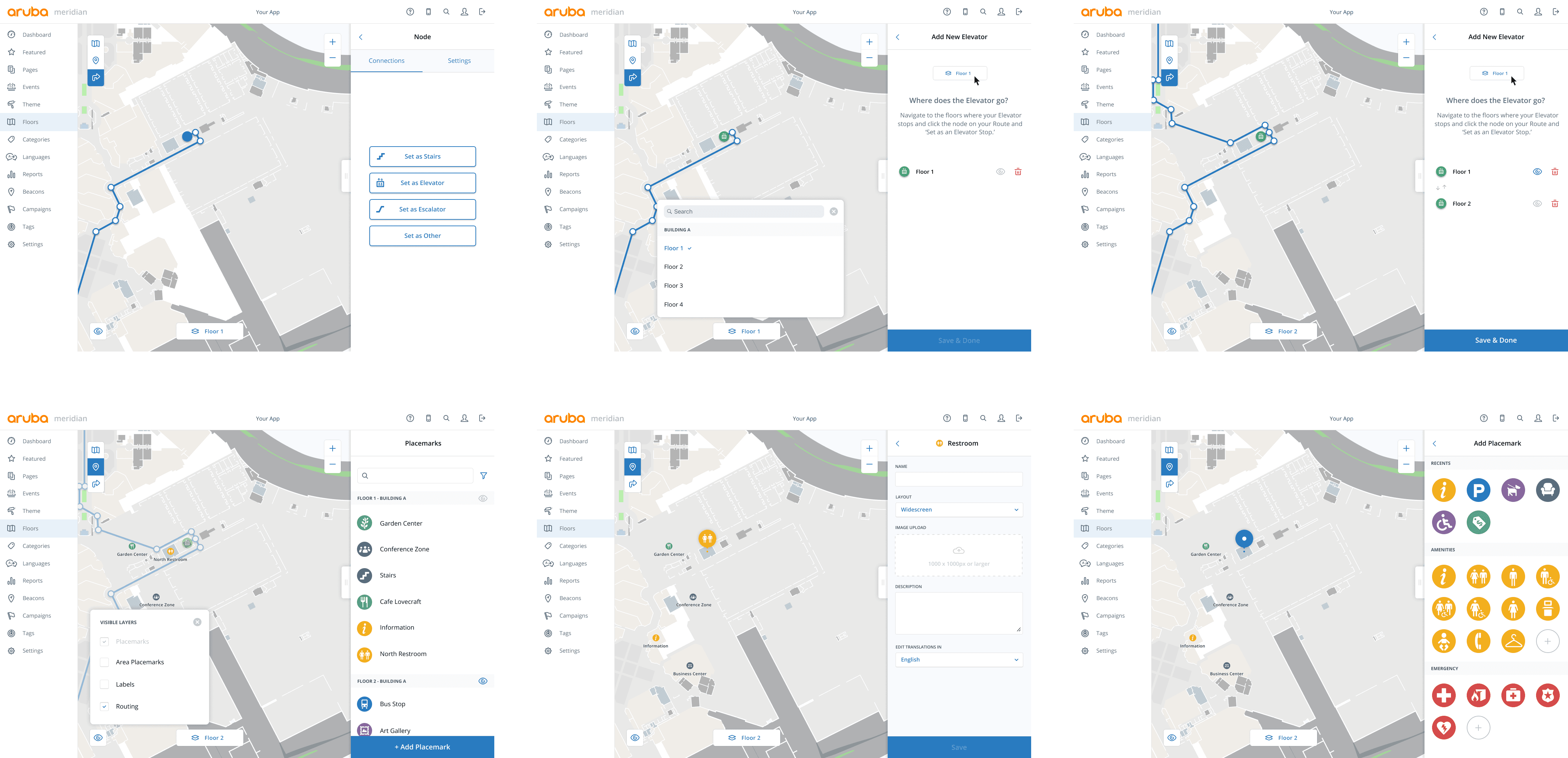
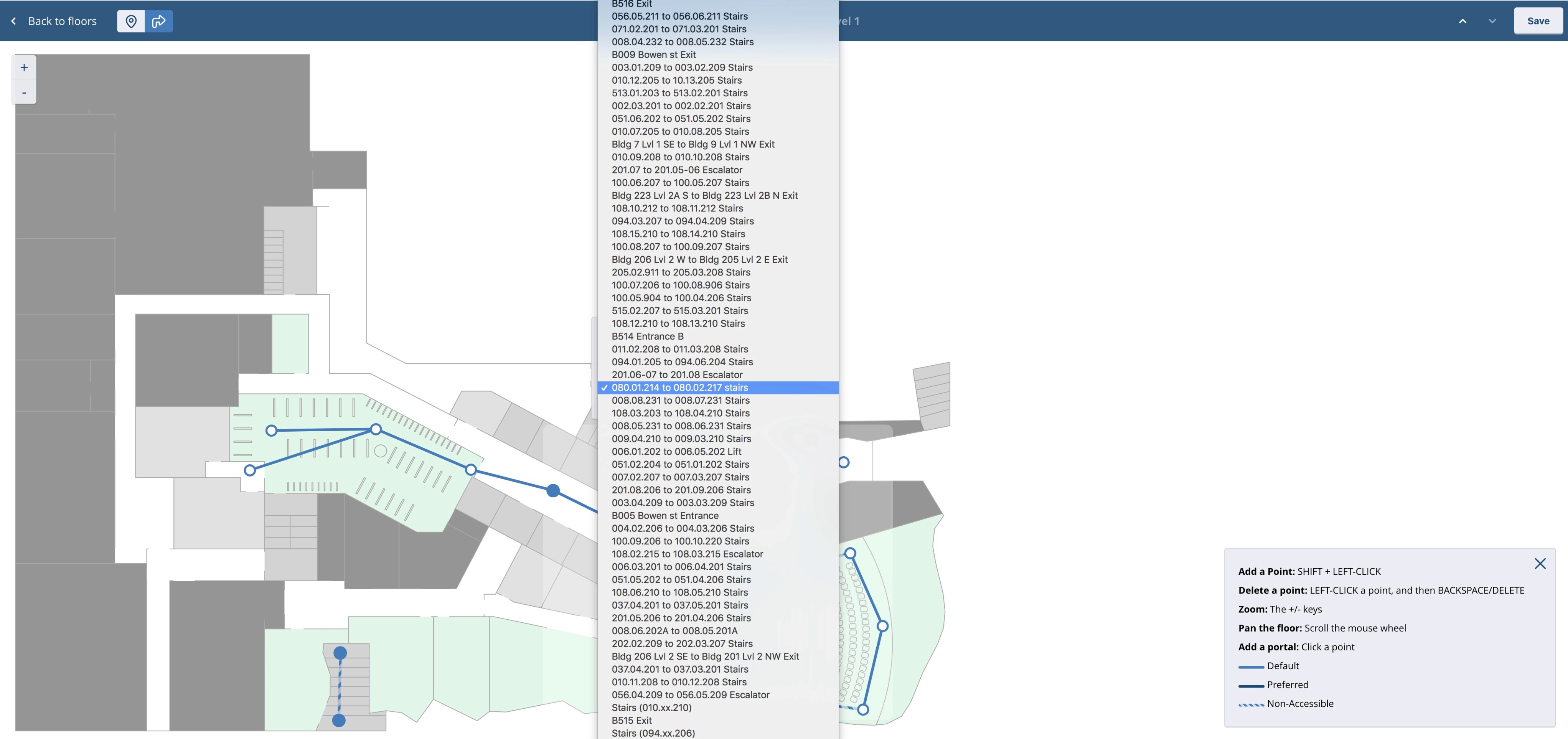
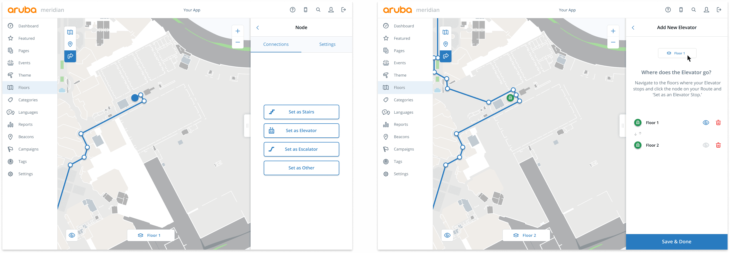
When our customers construct the routing for their maps in the existing workflow, they often encountered a tool we originally called 'Portals.' These acted as a means of connecting routing between different floors (think: elevators, stairs, etc.). Unfortunately, not only was this tool confusing, but explaining to a new customer what a 'Portal' is can be frustrating.
Traditionally, our customers would have to create long and confusing naming conventions to keep track of each 'Portal.' In order to simplify this interaction flow we discovered that having no naming convention was best — that having the interaction be self evident and discoverable would simplify the experience.
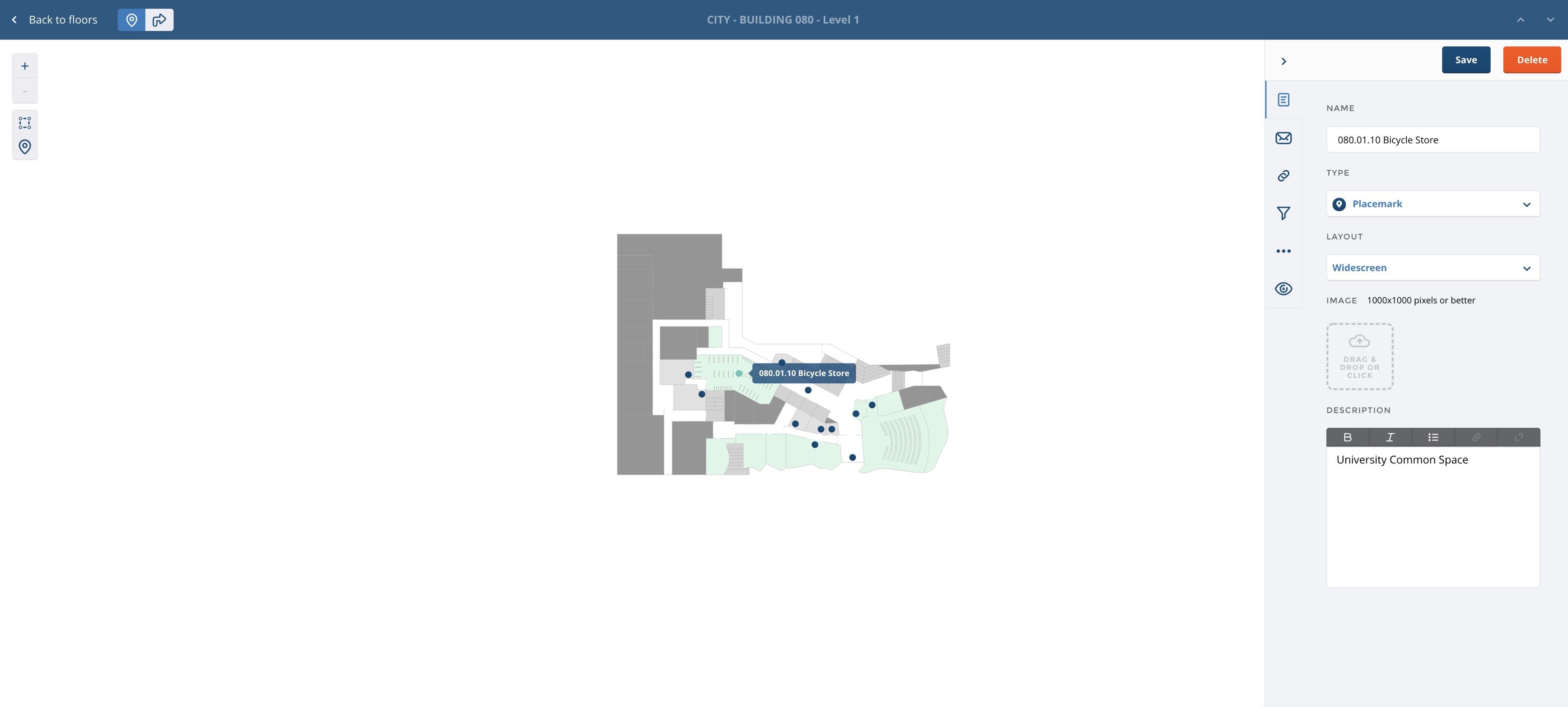
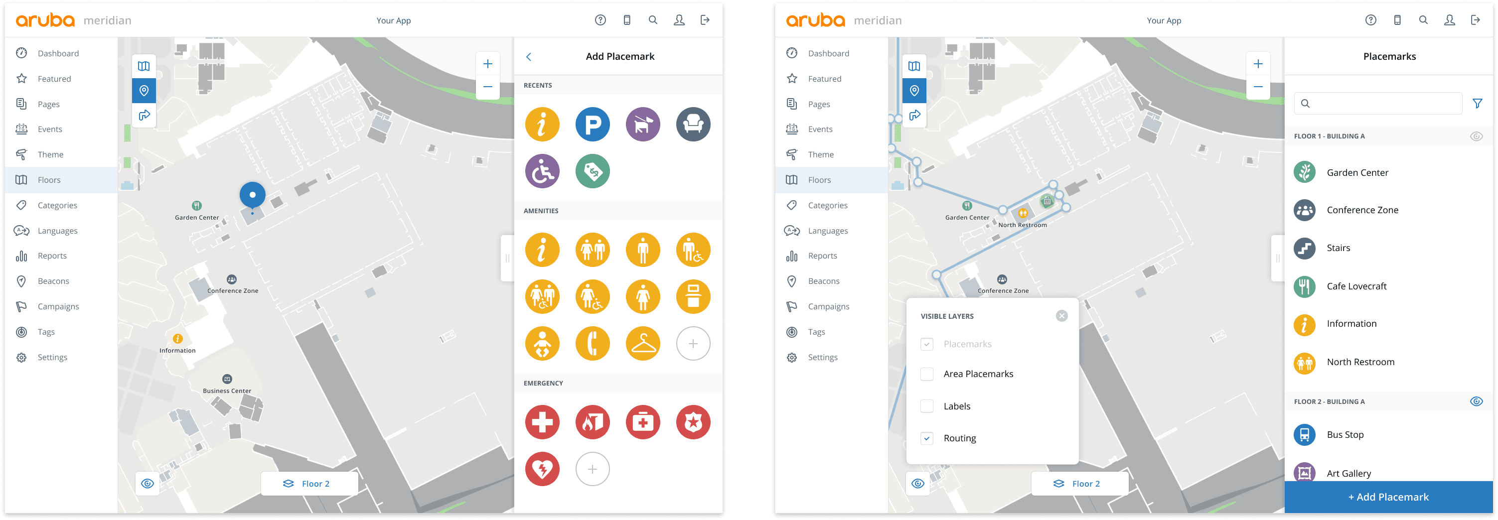
When a user adds points of interest (or 'Placemarks' as we call them), we wanted to improve the speed by which the user could add and edit them. Additionally, our previous version of the CMS was regionally specific, so we wanted to make generic the categorization of Placemarks. Another important piece our research uncovered was the desire of our customers to see their routing and Placemarks at the same time in order to ensure points of interest corresponded to where their end-users can actually navigate to.
Usability testing
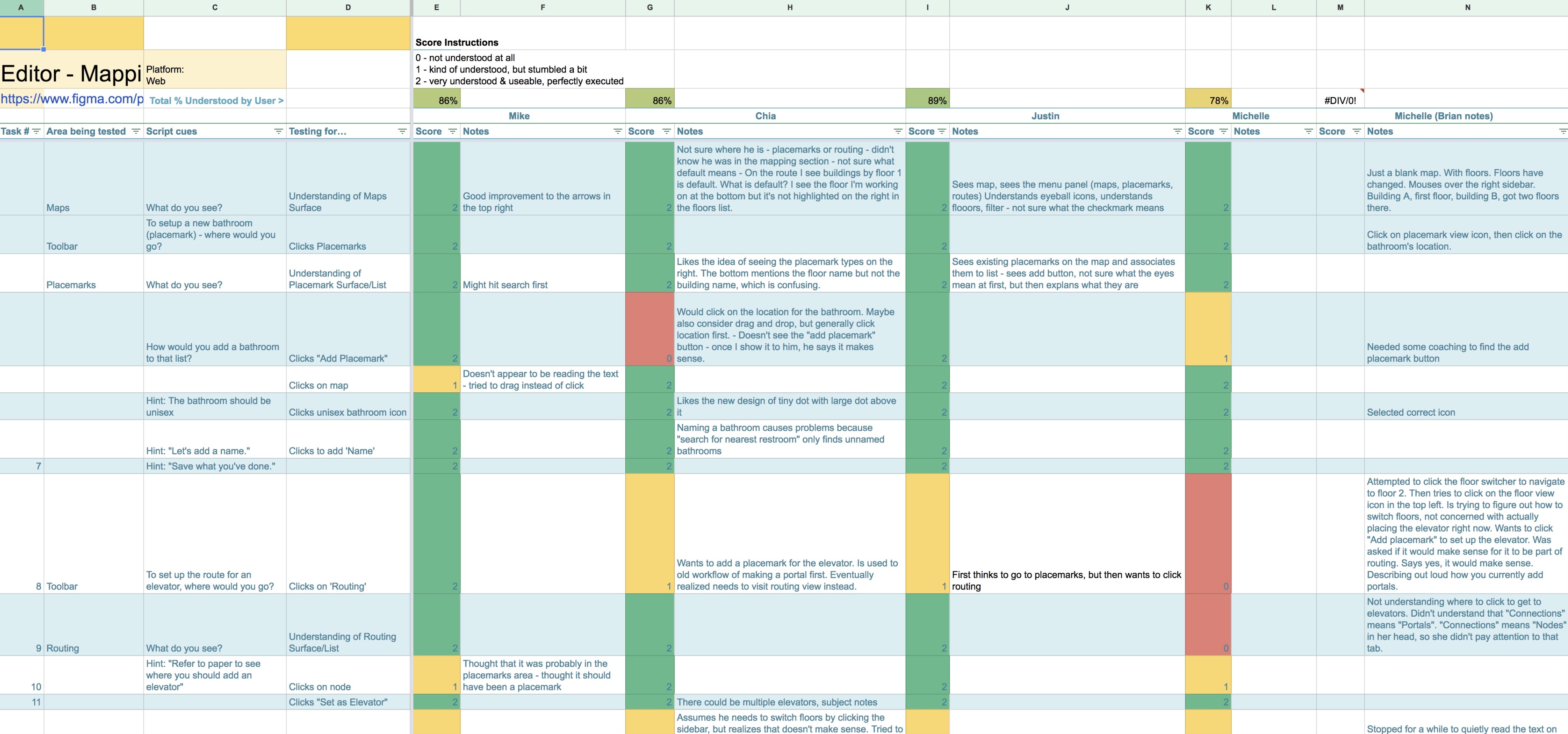
Throughout this process we regularly tested on users (internally and externally) to ensure we were making progress and to validate that our changes were improvements. As such, we focused on testing users on the essential questions we didn't know the answers to and made adjustments as we went to accommodate what we were learning. Keeping this succinctly within our spreadsheet, we scored each test and kept a metric as to whether our users were passing or failing.
Menu